Content Overload: When More Copy Hurts Your Marketing
We’ve all heard it before.
“Can you just make all of this fit?”
Technically?
Sure.
But that’s rarely the same thing as good marketing.
Whether it’s a brochure, postcard, flyer, banner, event display, or advertisement, the goal isn’t to fit as much information as possible. The goal is to help someone quickly understand your message and take the next step.
Those are two very different things.
More Information Doesn’t Equal Better Communication
It’s natural to think every detail is important.
After all, you know your business better than anyone.
But your audience doesn’t.
People don’t study marketing pieces the way you do. They scan them.
Research consistently shows you have only a matter of seconds to capture someone’s attention before they decide whether to keep reading or move on. That window can be even shorter for billboards, event banners, trade show displays, social media graphics, or a flyer someone picks up while walking by.
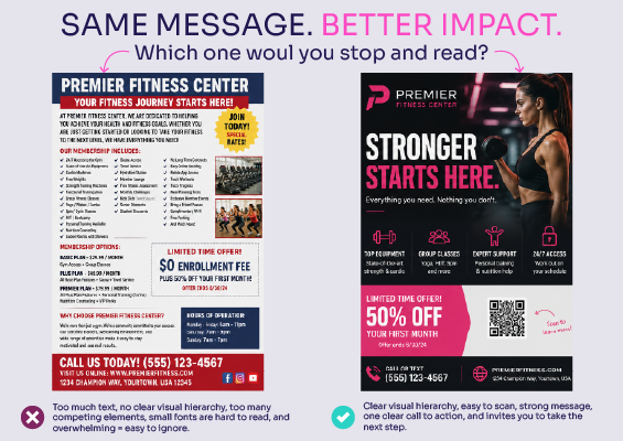
If they’re greeted with walls of text, tiny fonts, and multiple competing messages, they’ll usually move on without reading any of it.
Ironically, trying to include everything often means people absorb almost nothing.
Every Marketing Piece Has One Job
Before adding another paragraph, ask yourself:
What is this piece supposed to accomplish?
Is it supposed to:
- Generate a phone call?
- Drive someone to your website?
- Promote one specific service?
- Encourage someone to schedule an appointment?
- Start a conversation at an event?
If the answer is “all of the above,” the piece is probably trying to do too much.
A brochure doesn’t need to answer every question.
A postcard doesn’t need your company’s entire story.
A trade show banner doesn’t need every service you offer.
Their job is to spark enough interest that someone wants to learn more.
That’s where your website, landing page, sales conversation, or follow-up materials come in.
Curiosity Creates Action
Think about the marketing pieces that actually catch your attention.
They’re rarely packed with paragraphs.
Instead, they communicate one clear idea and make it easy to take the next step.
Maybe that’s scanning a QR code.
Maybe it’s visiting a landing page.
Maybe it’s calling a phone number.
Maybe it’s stopping to talk with someone at your booth.
The purpose isn’t to tell people everything.
It’s to give them enough confidence and curiosity to keep going.
Design Isn’t Decoration
Good design isn’t about making something look pretty.
It’s about guiding the reader.
Your eye should naturally move through the page, picking up the most important information first, then the supporting details, and finally the call to action.
When every headline is large…
Every paragraph is essential…
Every image is important…
Nothing stands out.
Hierarchy disappears, and so does the effectiveness of the piece.
White Space Is Working Harder Than You Think
One of the easiest things to sacrifice when trying to squeeze in more copy is white space.
Unfortunately, white space isn’t wasted space.
It’s what gives your content room to breathe.
It helps separate ideas, improves readability, and naturally draws attention to what matters most. In many cases, removing clutter makes a design feel more professional while making the message easier to understand.
Content Overload Hurts Conversions
Marketing isn’t judged by how much information it contains.
It’s judged by whether people take action.
A clean, focused design with one clear message and one clear call to action will almost always outperform a crowded piece that tries to explain everything.
The easier you make it for someone to understand what you want them to do, the more likely they are to do it.
That’s what drives conversions.
Good Marketing Helps People Decide
The best marketing pieces aren’t the ones that contain the most words.
They’re the ones that make the right information impossible to miss.
So the next time you’re reviewing a design, don’t ask:
“Can we fit one more paragraph?”
Instead ask:
“Will this help someone decide to take the next step?”
Because success isn’t measured by how much copy fits on the page.
It’s measured by what happens after someone sees it.
Remember, your goal isn’t to fit more onto the page. It’s to help more people take the next step. If your current marketing materials feel crowded or aren’t getting the response you’d hoped for, I can help simplify your message and improve your results. Contact me to discuss your next project.
Is your marketing trying to say too much?
I can help simplify your message, improve your design, and create marketing materials that capture attention and encourage people to take action.